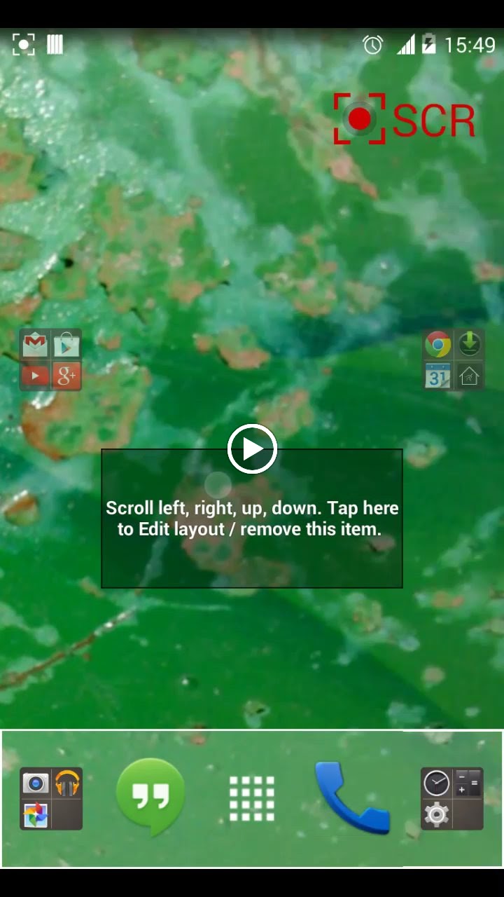
DefaultStock

DefaultStock
Challenging to create something nice with no widgets and no completely transparent trigger areas and other hidden things like gestures.
I went with that stock look (as i do) most people use when they think they have a minimal set up, bottom dock thing and folders on either edge.
This one is for LL it will use th system wallpaper I’ve done what i can to show how configurable folders, icons and screen scrolling can be, Grid is 5 x 6.
]]>« Updated with panel for better clock. (Previous Post)
 D5 Creation
< ![CDATA[
I love that one.Really shows a lot on the different capacities of LL. The screens are a bit empty, but due to the requirements, it’s hard to do it differently.
]]>
< ![CDATA[
I really like the actions sidebar idea!
I must say that you’ve done a great job, considering how constrictive the rules are, I’d really like to participate, but I’ve got no ideas, amazing that you’ve managed to do something like this.
No matter how your work fares in the competiton – the actions side bar should be added in some way to the version, that gets implemented. Perhaps add a few more actions and make it scrollable.
It’s a great way IMHO to show what can be done and it also encourages to try different options, as they are right where under your nose just waiting to be explored and tried out!
]]>