now browsing by category
Pierre Hébert
Issues with newest ‘alpha’ release.
See screenshots attached to post.
Logcat at: https://www.dropbox.com/s/1sx5dg6v5z09sef/2016-09-09-14-27-07.txt?dl=0
(Sorry for it being in the wrong category. My current theme (CM-based) has a G+ bug, which didn’t let me see the text on the category-selection screen.)


Here is a challenge: Who already has or is working on the best looking/practical theme/setup/build/rig (insert your…
No 3rd party widgets or tasker. Just straight up, raw LL.
You can use scripts and custom views and anything that it is intrinsic to LL such as special permissions and the like!
Post Below!
]]>All script, all Lightning.

All script, all Lightning.
Game on, Lightning.Kiddo aka Jappie Toutenhoofd
Originally shared by Lightning.Kiddo
DeLuXe-template overview.
[Card effect by Lutz Linke]
]]>Vintage Tile that
Originally shared by Masaoka Taro
はじめまして(^ ^)
よろしくお願いします
LLを使ってタイル状にしてみました


So it’s time for members to vote for their preferred setup !
Anyone interested in this contest can use the following link to vote.
I have seen great ideas in submitted posts, and some of the themes presented here certainly qualify for a standalone template 😉
Thank you very much for your participation !
Edit: if using the Google+ App, the link is not available, in which case use the member name instead of the link.
]]>Oookay… here’s a single screen version of my last theme.
Sadly short after the contest deadline (any chance, though?). But “lady first”, young girl needed her bottle of milk and diapers changed.
Sleep is overrated, so I threw together the bits. While it works okay, I’m not write satisfied. I’d like more empty space. Will tune it, but not now. 2:50, time to get some sleep.
My second entry for the contest, shore before deadline. Descriptive screenshots will be added shortly.
Summary:
– Expandable main apps folder (“panel” from LLX Alpha)
– Vertically scrolling panel for widgets
– Multiple folders for categorizing apps
– Elegant Clock created solely with LLX Dynamic Text(!!)
– 3 different clocks in horizontally scrolling panel (NOTE: Josh Gray mentioned this also, just borrowed the great idea!!)
– Different Styles though loadable settings: Holo Light and Dark backgrounds; borders light, dark, Holo blue/magenta/red/orange/green
– Portrait only for now, did not have time to arrange in landscape (but will, have ideas)
– Works with any wallpaper
– Icons are all Android developer icons, thus free
All widgets used in the “Widgets” panel are purely for demonstration purpose, not included in theme!
Enjoy…
Whatever the contest brings, I think this one I’ll try to publish as APK soon.
I thought that panels were not necessary in the contest, anyway this is my entry with them. (Small change)
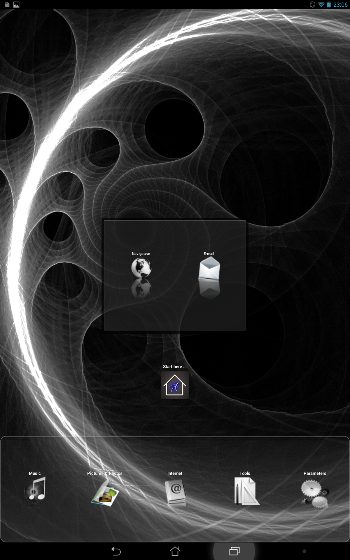
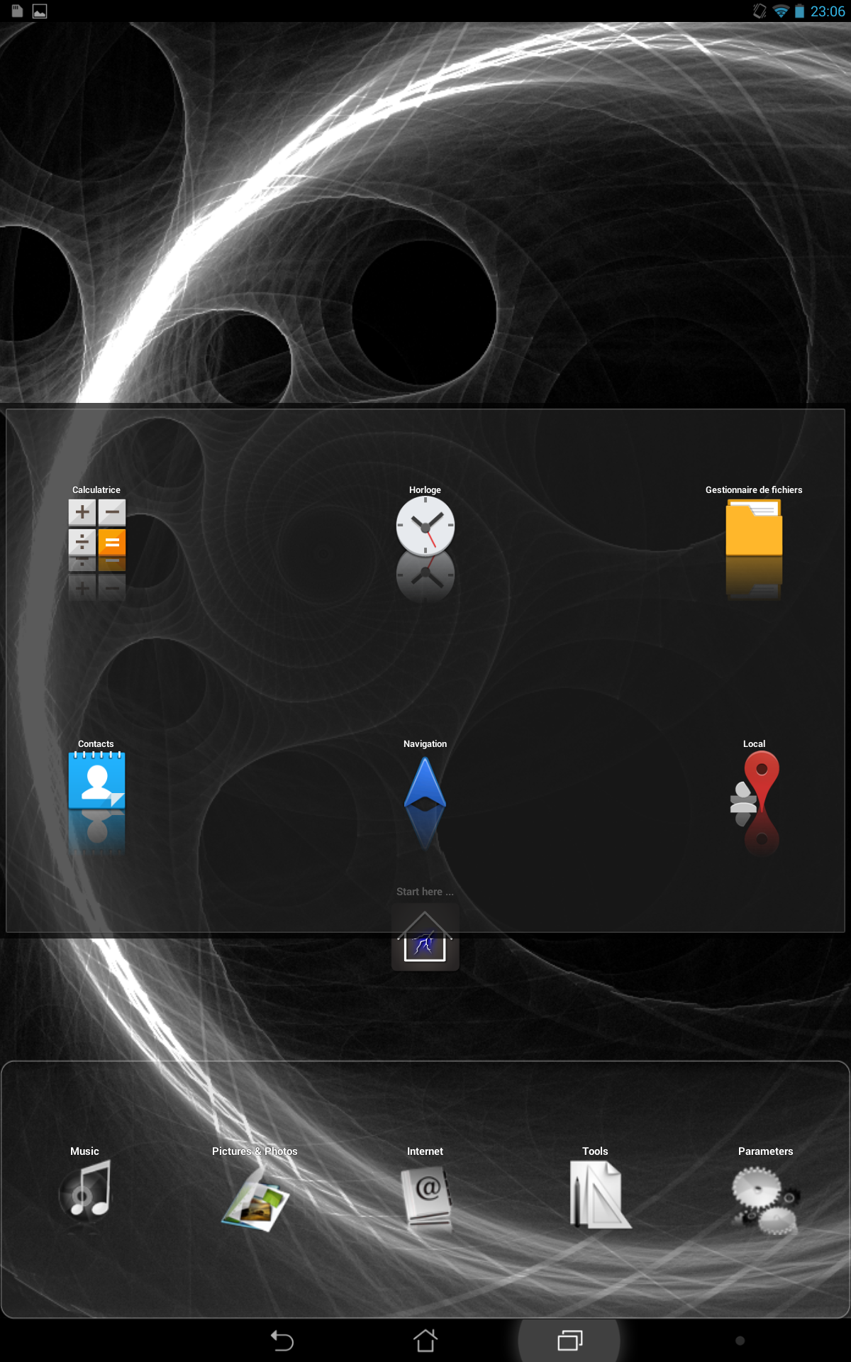
It’s a simple one, easy to add new apps, pinned panel with settings (a bit different dock), help folder in free mode…
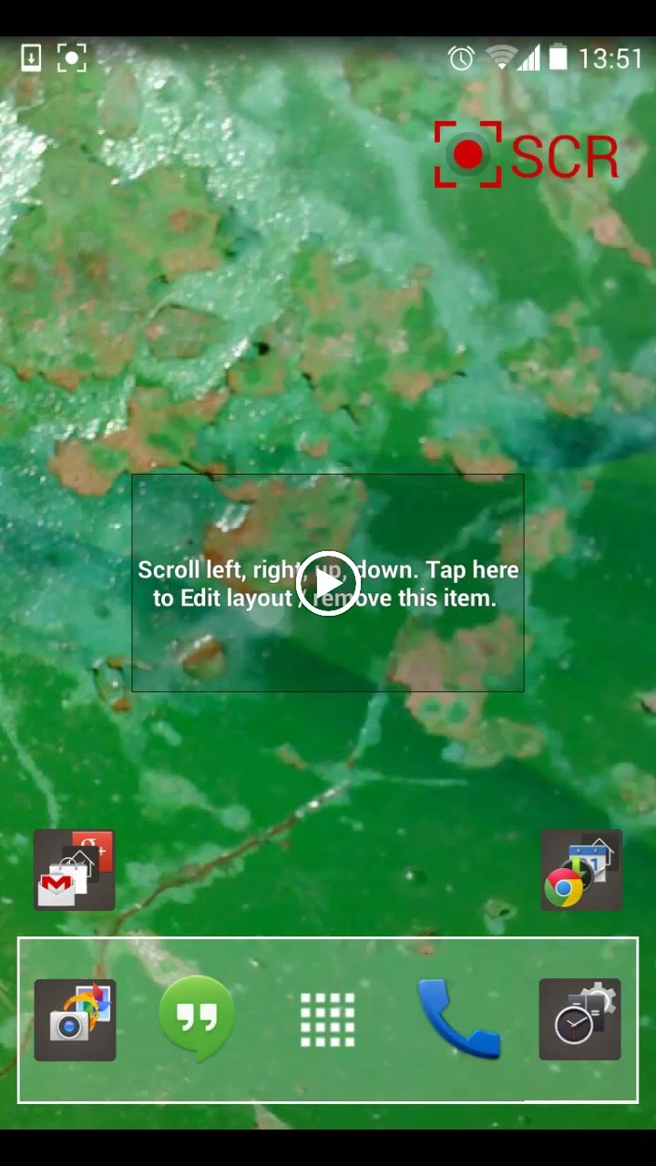
Sorry for the poor quality of the video, there is a screenshot to help you imagine how it is.
You can also check my older entry without panels. [ https://plus.google.com/app/basic/stream/z12kiplhpsjcjxzp404cf3nbvqrpu5qgmbc ] (not sure if the link work)


New version of my light theme for LL contest.
ps : That theme was made on my 10′ tab with 200 dpi parameter (stock rom is 240 dpi) and that is the reason of so small text caracters. On a standard phone, the text would be larger and more easy to read.


 D5 Creation