now browsing by category
Using item’s icon background/mask for circle/rectangle shapes.
Do you download and install pre-created iconset for circluar/reactangular app icons? Yes, it’s well designed, but it doesn’t provide my all-apps, right?
Using LL’s mask feature, we can have circular/rectangular( or hexagonal, or any shape you like) icons with app’s default one.
You might designe more sophiscated BG/mask image, however, just for enjoying this feature instantly, I uploaed circle/reactnagle images.
Adapting this doesn’t hurt your current desktop icons. If its not good, just set to “Default Icon”, that’s it.
How to adapt it
Goto Custumzing –> Current Desktop –> Items –> ICON
In menu, you see Background images and Mask menu in LAYERS part. In those, you choose each bg/mask image for circle or rectangle.
AND, you also see Inner scale menu in same menu part. Increase it to some value greather than 100%. I used 150%.
I think you could understand why we scale up default icon’s size.
I didnt use overlay image, because I have no good idea, but you may.
Pros: we don’t need to install extra iconpack which has limited one.
Cons: we scale up default icon a liittle, and it may dequalify images.
Wonderful LL~


This is just a quick video I made to help someone and i thought I would post it here, I no the colors are messed up…
How to prevent navigation to an area

How to prevent navigation to an area
The purpose is to prevent scrolling in a region which should remain inaccessible, typically a corner created by using two side areas.
On the screenshot two “side bars” are visible (clock and calculator on top, camera, gallery to the right).
Prerequisites:
– LL V8.7.b3
– Option “Snap to pages” is off
First prevent scrolling on the corner with two SP configured as barrier : 1 and 2
Then prevent scrolling beyond the side bars (top and right) with SP 3 and 4 (also configured as snapping for easy scrolling)
Finally add SP 5 and 6 which will respectively stop vertically and horizontally on the page edges. These SP are snapping too.
This way, if you scroll up, clock and calculator will appear, but you won’t be able to scroll to the right. You need to scroll down a bit before, then scroll right to reveal camera and gallery.
]]>Following a discussion with Chris sledge and +Keith Rogers, here is a short tutorial on how to share your setup…
1) make sure to set the home desktop so that peoples loading your theme will start with the right home desktop.
2) export your setup using “Customize Lightning / Export for APK”. You are asked which desktop(s) you want to export. This is useful when you have several desktops, the one you use, and the other(s) you want to share. The operation will create a file named “Template” located in “/sdcard/LightningLauncher”.
3) copy this Template file on your PC, and point your browser (please use Firefox at the moment) on http://www.pierrox.net/android/applications/lightning_launcher/packager/packager.html
4) set a package name, upload the file and an icon for the APK, and once files are uploaded, click on “Download source package”. This will download a zip: unzip it somewhere on your PC.
5) launch Eclipse or Android Studio (easiest is to download adt-bundle here: http://developer.android.com/sdk/index.html)
6) import the project by browsing the package you previously downloaded and unzip at step 4
7) build it and export it (a tutorial using Eclipse here: http://www.programmingodyssey.com/2013/01/create-signed-android-application-using.html)
Then it is up to you to share your APK the way you want (Google Play, other app stores, by email, on your web site, etc.).
Hope this helps !
More infos here: http://www.pierrox.net/cmsms/applications/lightning-launcher/templates.html
]]>Actually i did it before work.

Actually i did it before work.
Example of one row/column sidebars all around a single home screen using new stop points settings to avoid scrolling passed them.
i have not populated th right and left sidebar widgets yet as i was just playing around with it.
Bob Chernow
Jacob Nyhart
]]>Google+ feature
A little feature from Google+ that few some people maybe know but I’m sure that a lot don’t.
Exactly: you can italize, bold and cross.
Simply write the words/sentences between: _ * – respectively.
You can also combine them
Furthermore they work in Hangouts. (Maybe in play store too? I don’t know )
🙂
]]>Can I set an icon or text so that when I click on it, it will switch to another part of my desktop?(hope you…
Title
Building Popups with the Folder-Function of LLX (Lightning Launcher eXtreme)
This Tutorial will show you to bulid Popups with the functionalty of LLX without 3rd party widgets.
It’s not well designed and KIS (keep it simple). Design and other stuff will be you own part 😉
1. Creating the PopUp
• Long tap on empty Space of you Screen
• Select Add..
• Select Folder
• Long Tap on the new Icon
• Select Customize
• Select an Icon and/or Custom Text to change
• In some cases it’s needful to use an empty/transparent picture as icon
(but do this later when you are almost fineshed, because it’s easier to find it)
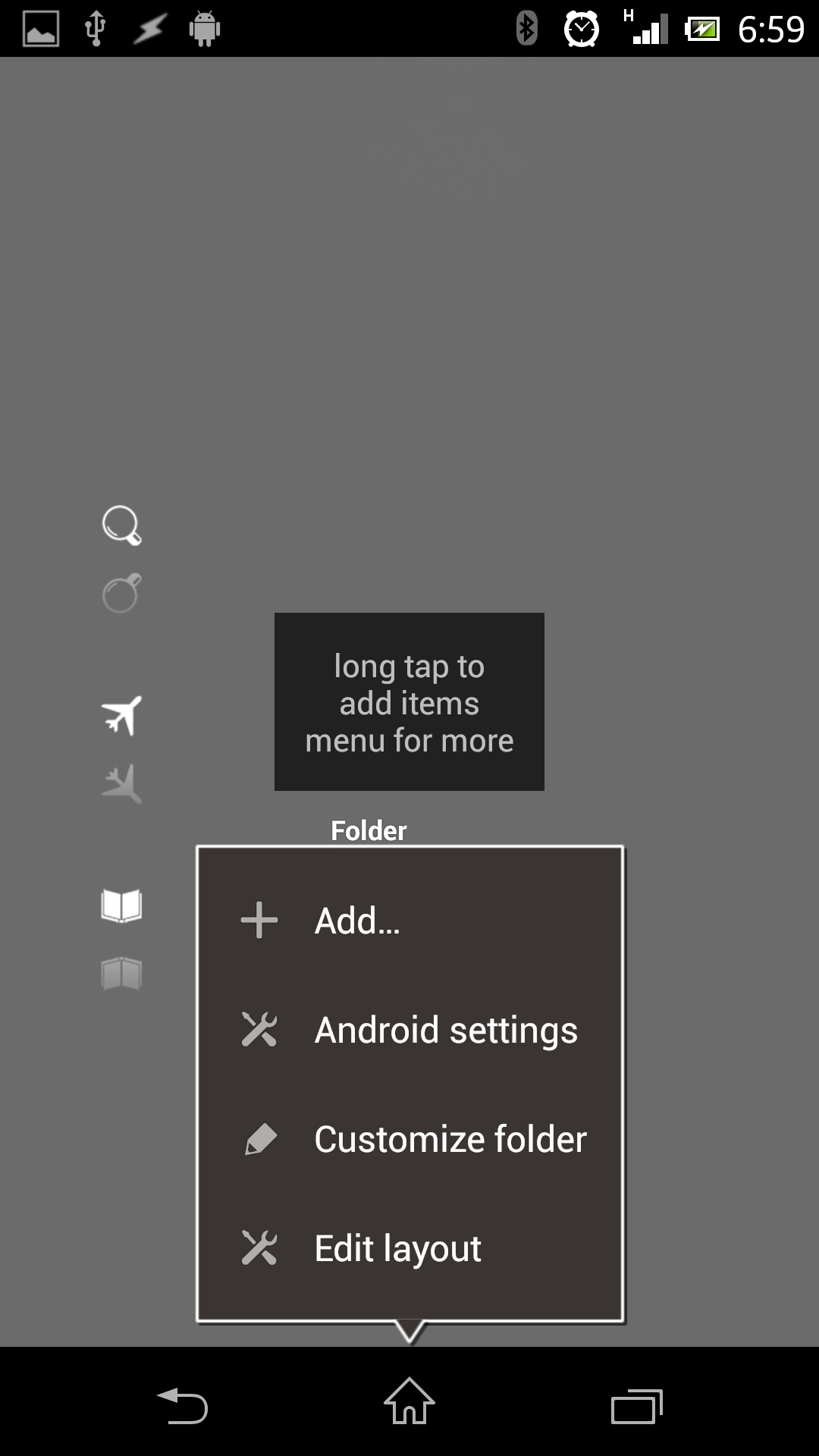
• Tap the icon (see picture1)
• Long tap on the popup
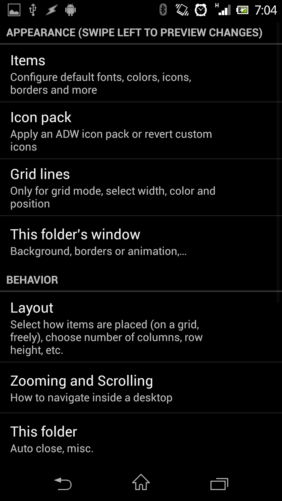
• Select Customize Folder
• You see now possible Configuration for this single Folder (picture3)
• It’s like a Desktop in LLX
• Select Folders Window
• Uncheck Display the title
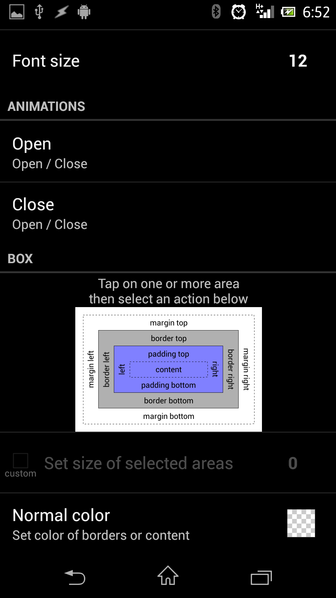
• Choose Open and Close to set the Animation
• Select in the Box the Area as shown in picture2
• Tap Normal Color and select 00000000 full transparent as color
(very essential for the popup !!)
• Additional I suggest to configure the Layout as you configured you Desktop, specially the Gridrows and Gridcolumns
• Go back to the Desktop
• Tap the icon (see picture2)
• Long tap on the popup
• Select Edit Layout
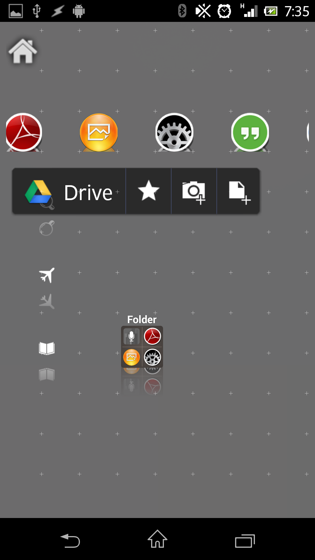
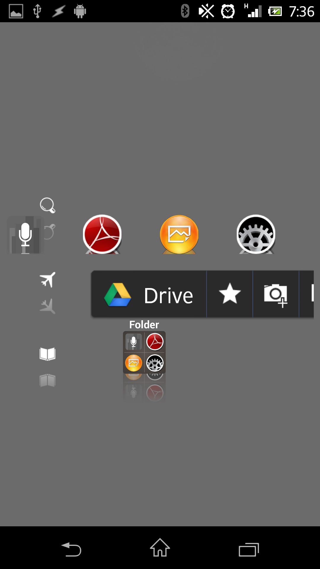
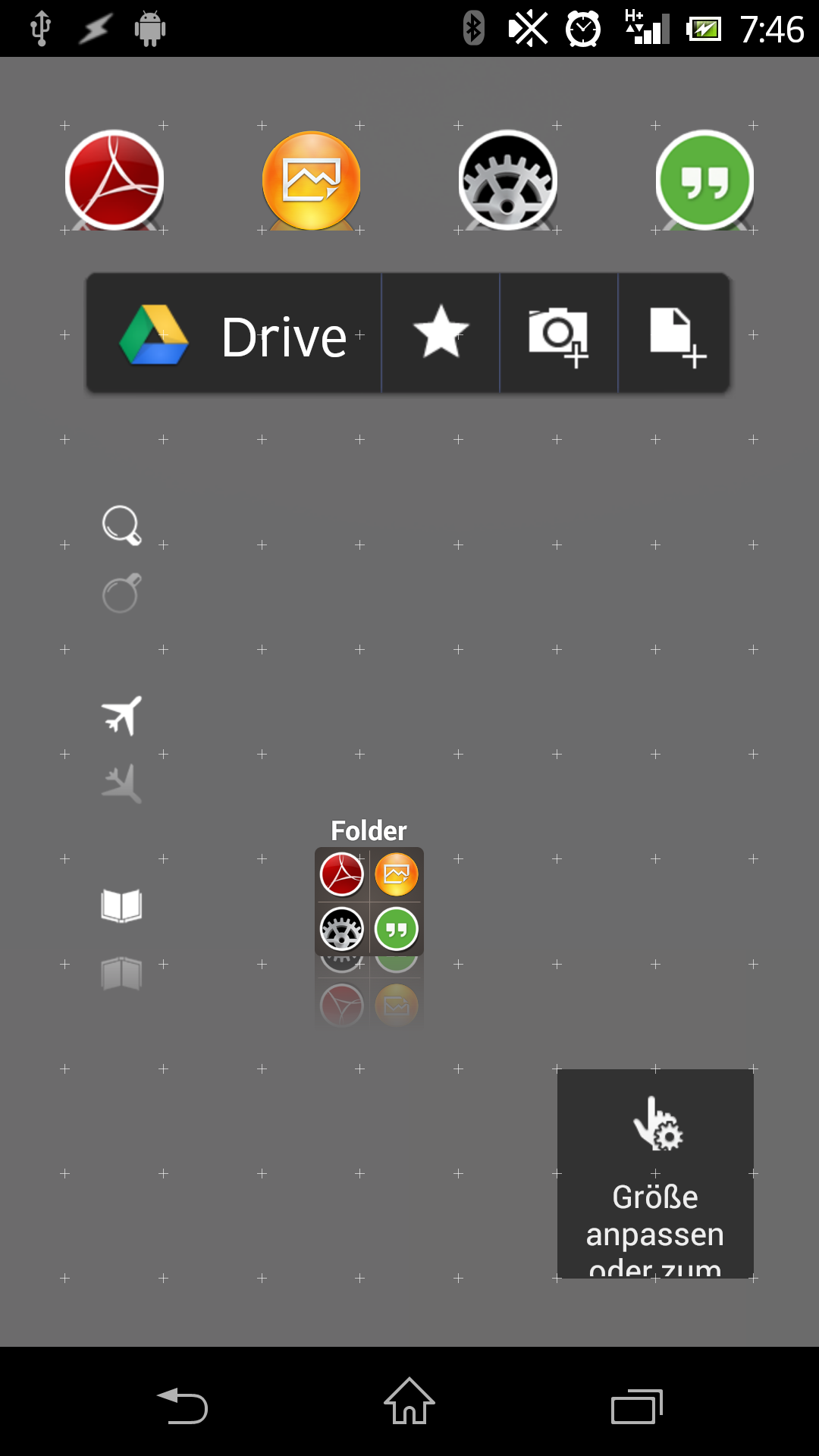
• Now add Apps and Widgets as you want Picture4
• When you tap now the folder Icon it looks like Picture5
• LLX automaticly adjust size and postion of the folder-popup
• But we want it that it looks like we have designed it, in this example at the top of the Screen
with a “nice” background
2. The “Trick”
• Tap the Icon
• Long tap on an empty space of the “Popop”
• Select Edit Layout
• “move” the “FolderDesktop” onto the postion you want
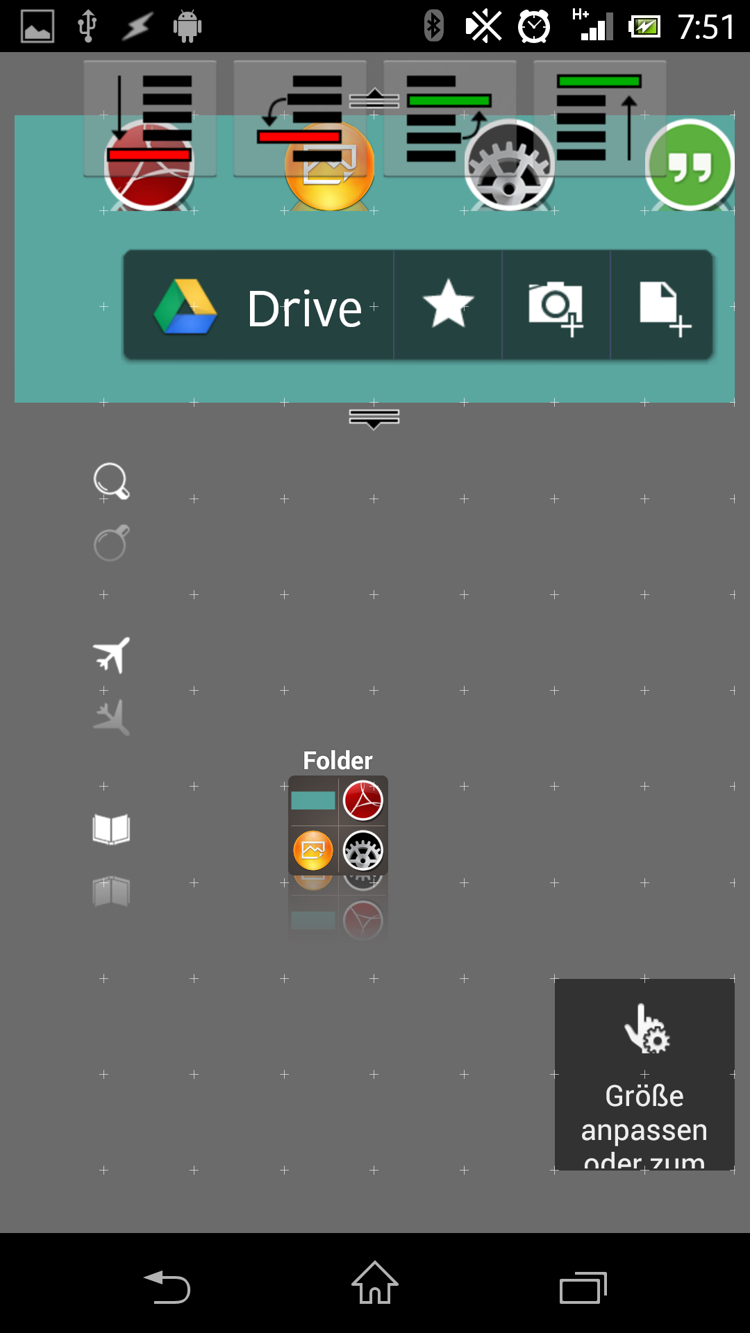
• Add a (in this example a zooper-) Widget Picture6
This will LLX force to make the popup bigger.
• Add a second (in this example a zooper-) Widget picture7
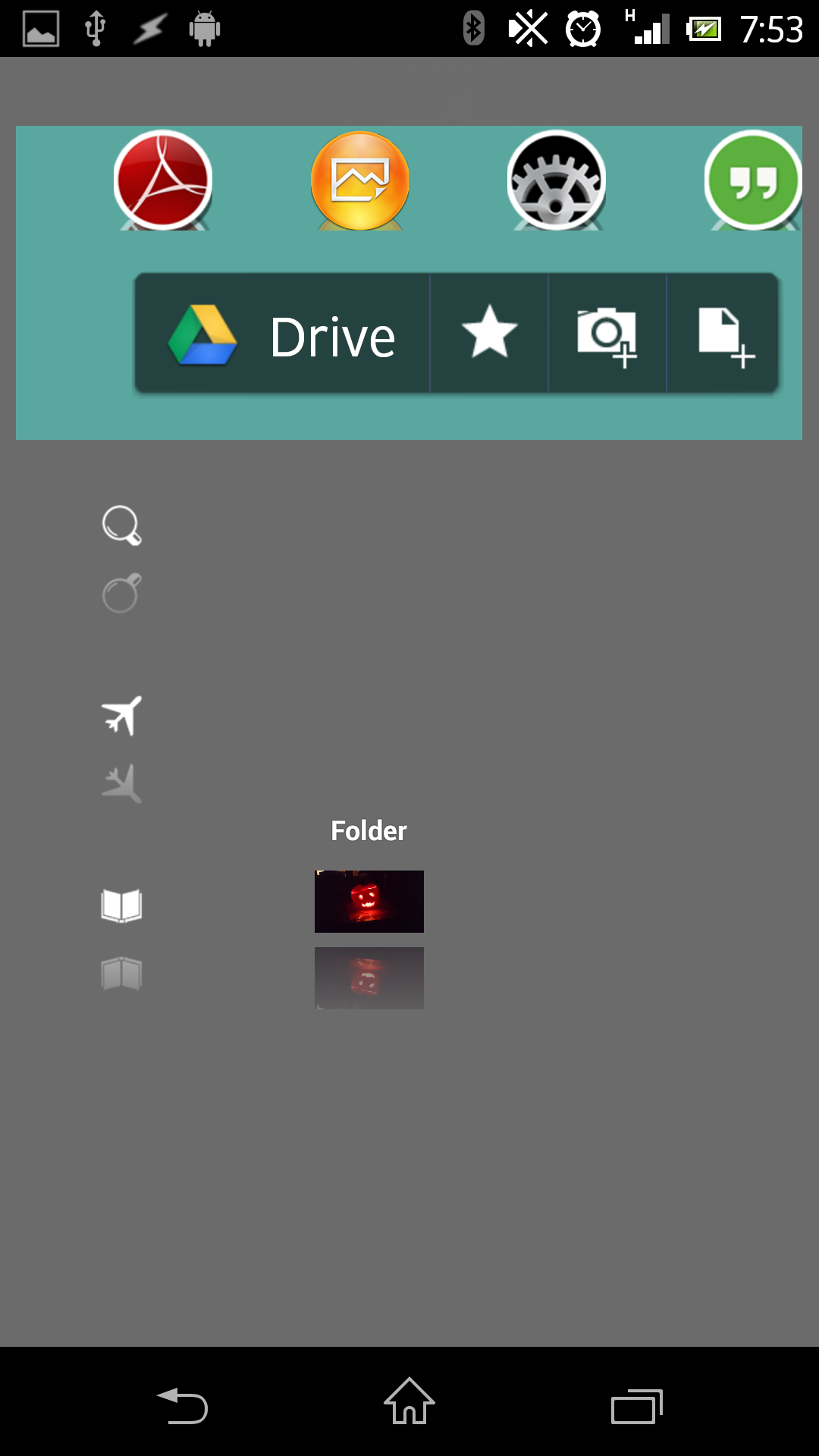
• Change the Background of the 1st Widget to transparent
• Change the Background of the second Widget to a “nice” color
and position it in the background
• That’s it Picture8
addition:
you can also use a Transarent icon without functionality for the “trick”
Someone interested in?
How-To build PopUps in LL without Popup Widget.
If enough (let’s say a minimum of 5 g+ers) will say yes then i’ll do a Tutorial for this 😉


 D5 Creation