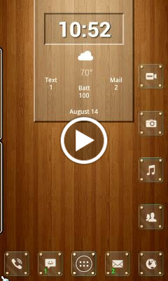
Messing around with sliding panels on both sides, and came up with this.
Posted by: pierrot | on August 14, 2014
–2 panels on the left side for widgets
–1 sidebar on the right for lesser used apps
–1 top bar type panel at top for notifications, weather battery, whatever
–Various folders down right hand side
Icons are from the Tiny White package. Glass icon backgrounds are from Glass Frame icon pack. Just used the background, and changed the corner “mounts” from silver to gold in PS. Calls, texts and emails are shown on the appropriate dock icon, in addition to the top notification panel.
All panels return to “home” position, by hitting Home button, via TrianguloYMulti-container Bookmark script. (I love that script and use it all the time… so simple!)
If TrianguloY could make it use labels instead of id, it would make the templates more completely shareable… hint, hint… :-)


Posted in | 7 Comments »
Tags: Chris Chastain
 D5 Creation
< ![CDATA[
Thanks brother
]]>
< ![CDATA[
Love the look. Have a similar setup, but have a question. I have seen a number of setups like this that have the little “handlebar” on the panels like you have on the left. How do you achieve this?
]]>
< ![CDATA[
Scott Adkins, the handle things are 9 patch files.
That particular one is the same file I used with icons and folder backgrounds in my SmoothglAss setup.
Just insert as a “do nothing” shortcut, detach from grid, squish them horizontally, stretch vertically, and bump up to the edge of the panel.
Those two panels consist of a panel within a panel.
The handles are in the main transparent panel, at the leading edge of the partially transparent panel that contains the widget.
Hope that makes sense!
Hey, btw…
This is what that example mockup I made for you awhile back evolved into 😉
]]>
< ![CDATA[
Chris Chastain Yeah it looks nice. Very similar in function to my set up. Very nice setup.
]]>
< ![CDATA[
Nice work very detail like your buttons on home screen sweet setup.
]]>
< ![CDATA[
Thanks Mik
]]>
< ![CDATA[
Very nice
]]>