now browsing by category


Widgets…

Widgets…

I have two problems, positioning and resizing.

1 Positioning.

I seem to always end up having to move them after adding them. How do I control that already when adding them?

2 Resizing

If I resize, the content also resizes (unlike icons for apps). Is there a way to keep the size?

Happens e.g. when adding a Zooper widget that doesn’t fill my selected size (add Zooper 4×2, chosen content might be 2×2, not always ckear in Zooper what the original size is – resing it to 2×2 makes content 1×1 or something).

]]>

Hi everybody

Hi everybody

I’m new in the community and LLX

I got a nexus5 and tried to create a new home but I’m not able to make both status bar and navbar transparents . anybody knows how can i do this ? Thks for help

]]>

I would like to start a wiki for LL, where could one be set up?

I would like to start a wiki for LL, where could one be set up?

]]>

can anyone help me how to create like a pull tab for opening folders?

can anyone help me how to create like a pull tab for opening folders? like when i wanna open a folder i just drag the tab instead of using gestures…… it would help with my theme as I’m trying to set up so some folders open by pulling a tab and others with gestures. an example is when i wanna glance at the clock real quick and then close the folder that’s where a pull tab would come in handy and when i wanna open my slideshow that’s where a gesture would be handy as opposed to a pull tab. i got the gestures down i just need to set up my tabs.

]]>

provisional solution for different wallpaper in portrait layout and different for landscape layout

provisional solution for different wallpaper in portrait layout and different for landscape layout

1) For portrait layout set original android wallpaper, how you best suits. (Customize Lightning…/settings/current desktop/wallpaper and background/change the system wallpaper…

2) Add…/application or shortcut/choose some item. For example shortuct/activity/ll-action/do nothing (lock). Now you have on desktop new icon (house with lightning).

3) long tap to this icon. Customize…/more…/ in text set display the label to no. In Icon set display the icon to no. In Box select (tap to) content and  select normal background (and choose your prefered picture optimalized for landscape layout). In + set clickable to no. Press back key.

4) Now you are on desktop. Go to: Customize Lightning…/settings/current desktop/layout/dual position set to yes. Now go to: Customize Lightning…/settings/general/Honour pinned items in edit mode set to no. Press twice back key.

5) Now you are on desktop. Long tap to free place and select edit layout. Now long tap to your shortcut with your new picture wallpaper. Select positions…/move front/behind/ and select left red icon, now press back key.

6) Now you rotate your device to landscape layout. Find your shorctut with picture. Tap to free place and select edit layout. Now long tap to shortcut and select position…/detach from grid, zoom out, and resize your shortcut for all home screen (bordered with white line) – you can zoom in/out for better work. If you resize shortcut, you can see white line on shorcut. Please add this white line to white line from editor layout. (for all side). You can long tap to shorctut and select position…/geometry/ Press dot in cross. Press width and set your width. Press height and set height. Again press dot in cross (many time) now is on screen with left and top. Please set left 0 and top 0.Press back key. Press home key. Long tap to free place, select edit layout/position/pin. Press back key. Now you have own wallpaper for landscape layout different from portrait layout, but…

7) Now you are on desktop. You must have device in portrait layout. You can see your shortcut with wallpaper for landscape layout. Now we must hide this shortcut. Long tap to free place and select edit layout. Now long tap to your shortcut and move this shorctut outside the screen (far away after white border). Press back key. Press home screen button.

8) Propably on both layouts (landscape and portrait) you can now slide with other apps and widgets… You can go to edit layout and add some stop point (How you prefer).

Unfortunately, this can not be solved for background in all apps (app drawer).

]]>

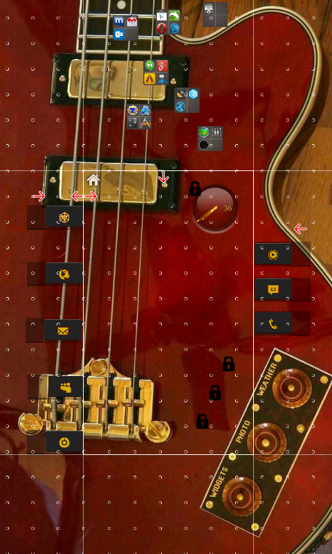
Zsolt Golenya, here is a screenshot of RumbleKat template in edit layout mode, zoomed out so you can see how the…

Zsolt Golenya, here is a screenshot of RumbleKat template in edit layout mode, zoomed out so you can see how the sliding “panels” are constructed.

Stop points are used so that adjoining pages only “slide” in as far as needed.

The folders in the top page are never seen because the upper stop point is a barrier. They are accessed through the buttons that slide in from the left side.

The stop points at the far left and right are barriers, so you can’t scroll past the intended edge of “panels”.

The two back to back stop points at upper left near the home icon are simply snap points so the screen will pop to its home page position.

Everything on the main page is pinned so it doesn’t move. I think this is the effect you are asking about. No swipe gestures, or LLX Panels are used.  Just simple scrolling.

There is a video in the apk section, to see how it works.
]]>

If anyone has time could someone make tutorials for panels, sidebars and stop points please?

If anyone has time could someone make tutorials for panels, sidebars and stop points please? Show how to add them edit and remove them.. I’m not super savvy with this stuff so please help

Ex : how do I get a stop point to stop the scroll midway through a page.. How do I get the sidebar hidden until I gesture it open etc. Thanks in advance

]]>

I wrote a small Tutorial .

I wrote a small Tutorial .

Zooper Integration into LLx Template for Playstore

It’s for advanced Users Which have a little experience with Stuff like this.

http://werksmannschaft.de/wordpress/zooper-integration-into-llx-template-for-playstore/
]]>

Not exactly a tutorial, but a good idea that you can use, if you didn’t realize about it yet.

Not exactly a tutorial, but a good idea that you can use, if you didn’t realize about it yet.

Some apps, specially old ones, have non scrollable widgets, even thought you can make them as big as you want. With the new feature ‘panels’ you can put them inside a panel and make it as big as you want. You’ll have a scrollable widget in a small space.

Hope it helps to someone (if not it helped to me)

]]>

Are there any tutorials on the panel effects I’ve seen lately.

Are there any tutorials on the panel effects I’ve seen lately.

]]>