now browsing by category
What version should we target?
Also I found an obstacle: adding a Go to Desktop and Position majorly failed when loaded on a device with not only different resolution but also different aspect ratio. Hoped LL(X) would take care of that and transform the coordinates.
Third thing: should the theme be more some sort of a feature showcase or a basic desktop pretty much usable from start for new users? I’m working on the later one, thinking a theme demonstrating as much features as possible should be downloadable as some kind of tutorial, but not a default theme. This might frighten new users.
]]>DefaultStock

DefaultStock
Challenging to create something nice with no widgets and no completely transparent trigger areas and other hidden things like gestures.
I went with that stock look (as i do) most people use when they think they have a minimal set up, bottom dock thing and folders on either edge.
This one is for LL it will use th system wallpaper I’ve done what i can to show how configurable folders, icons and screen scrolling can be, Grid is 5 x 6.
]]>Short video, even though I’m sure you all know how it works.

Pierre Hébert, is this wallpaper feasible from your coding stand point?

Simple gradient wallpaper, hideable, scrolling dock, slide out folders on left, right and top.
Stock app icons basically just used for place holders, for end user to modify.
Long tap in empty area shows status bar, short tap opens notification pane.
Tried to make use of almost all main features available in grid mode.
Is dynamic text allowed?
Updated with panel for Dynamic Text clock


I can’t get the post to show the screens in the right order with my phone. They should be in the opposite order.
Someone may be able to do a better job with showing variety without it looking messy..


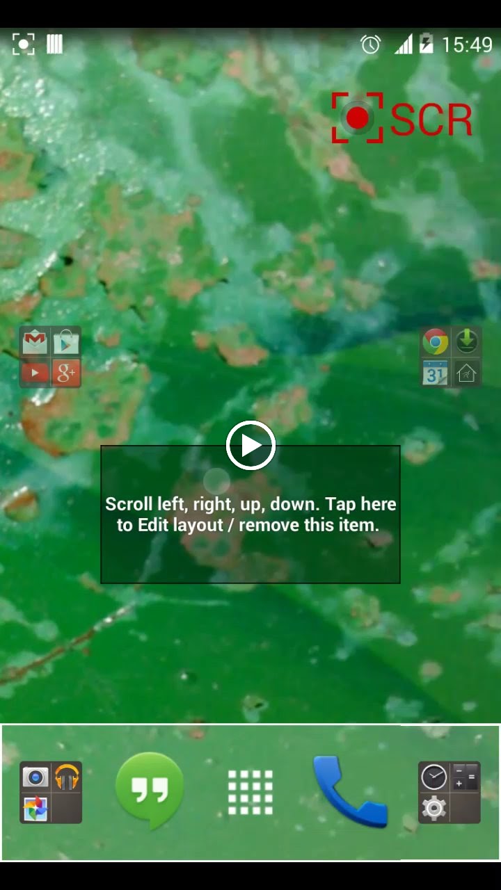
My simple setup (first)
The wallpaper can need to change. It’s just to see a very-simple one. (Made with the mobile phone)
Scroll left/right to different pages, they are default icons so when the user will add more, they will fit.
Scroll up/down to show/hide the dock. This will show how pinned items work.
The ‘help’ folder is a free mode one, it will make the user think “what?” and then they will discover free mode. (And folder properties)
Some stop points are added, they will help the user to understand them.


Post your layout here, including screenshots, videos and some description, as you like.
Everyone is invited. Starting at December 16th, community members will be able to vote for their preferred theme, then the highest rated will be implemented as the default Lightning Launcher layout.
Full rules can be found in the associated event description.
]]> D5 Creation